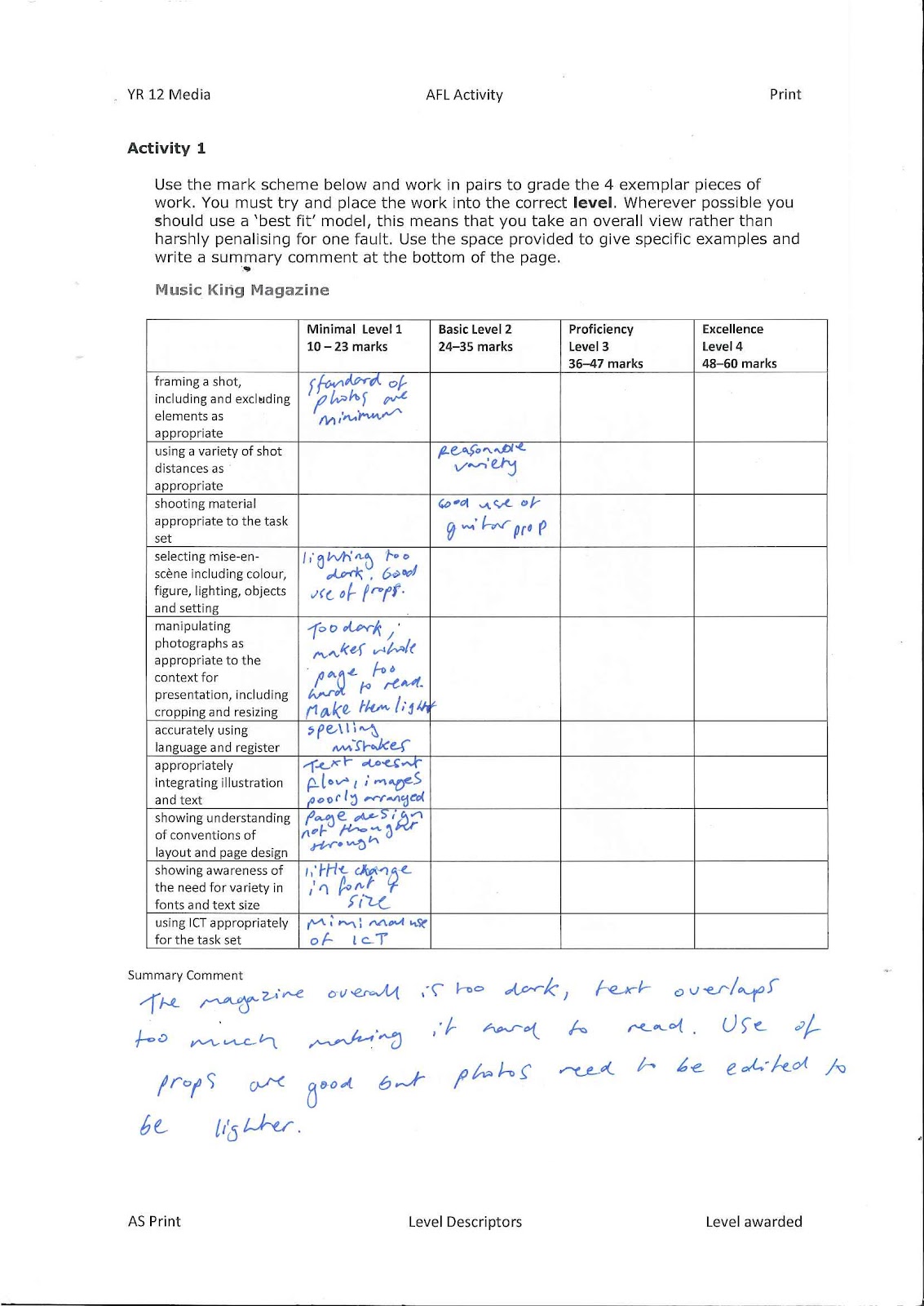
Feed Back Sheet
I am pleased with the feedback recieved, but i know that i can improve massively. Firstly, starting with the Front cover. I will definately alter the size and style of my mast head, as the font doesnt have enough impact as i would of liked, it needs to stand out more. The main focus of my front cover improvements are making my cover lines much smaller, varying the texts, and overall having more cover lines. I want to coose individual fonts for each band name. Plus the banner will be made smaller with more text improving the look of it. I am going to experiment with colours more, as I have uysed black text on a light blue background so I will try and find new ways to make the text stand out.
For my contents I need to experiment and alter the layout of my page, as at the minute it is not an effective layout, i will need to take more inspiration from other magazines that are published to a high standard. This will help me shadow an effective page layout. I am going to make the main photo smaller, and hopefully add in other small photo's to improve the layout and look of the contents.
My double page spread was effective but i found that I can make it much better with the use of a better positioned and better quality photograph. I am going to take a long shot and make it fill out both sides of the double page spread, this will stop me sectioning off the two sides which will make the page flow better. I will have to have a relatively plain background however, as I want the text to stand out so it can be read easily.
Tuesday 28 February 2012
Further Evaluation of Feedback
I decided on my feedback from my class and after furtther thinking that i have now came up with specific ideas on my magazine. I will use a group photo for my double page spread, showing the full band, each member will be doing something and not focusing on the camera. It will be a very casual shoot. This will connotate the genre of my magazine as it is garage rock, so the casual appearance of my band will relate to this.
Friday 24 February 2012


Friday 10 February 2012
Draft Magazine


These are my draft copies of my 3 elements for my magazine. I am pleased with the way they turned out, but there is a lot of room for improvement and i am confident I can gain a better quality when i improve these designs. Firstly my front cover, I wanted to connotate my genre with a not-so-serious pose, the one I used here mimicks this as he seems to be pulling a serious face. But, as my target audience is specific they will know the image is being sarcastic, as people related to the rock/altrernative genre are not that serious. I like the way the colours all match each other, as he has blue and red on his shirt I thought it would be appropiate to follow these colours up and use them in the rest of my magazine.
My contents page turned out really well i thought, i decided to use a different character with a different setting to give it a bit of variety. I like the layout for this contents, however i would like to incorporate more articles and sections allowing the text to be smaller so it looks a bit more busy and proffesional.
My double page spread turned out really well, i like the slanted divider, I chose this because it goes against the standard 50/50 design a lot of magazines use. This will help it stand out, i also like the messy font. This connotates the casual aspect of my magazing and genre. If I were to re-do it I would try and figure out a way to improve the layout of the text, making the overall page flow better.
Friday 3 February 2012


Thursday 2 February 2012
Test Shots


Subscribe to:
Posts (Atom)